Open Case Study:
a.s.r. Vergoedingenvinder
Healthcare Reimbursements: Bridging the Gap Between Policy & People
From a bureaucratic maze to an intuitive dialogue. How we transformed a -56 NPS pain point into a trusted service.
At a Glance (The Impact)
NPS Growth: From -56 to +7 within 3 months post-launch.
Support Load: Measurable reduction in customer contact about coverage questions.
AI Readiness: Established a structured data model ready for AI-driven search.
1. The Challenge: A Cognitive Mismatch
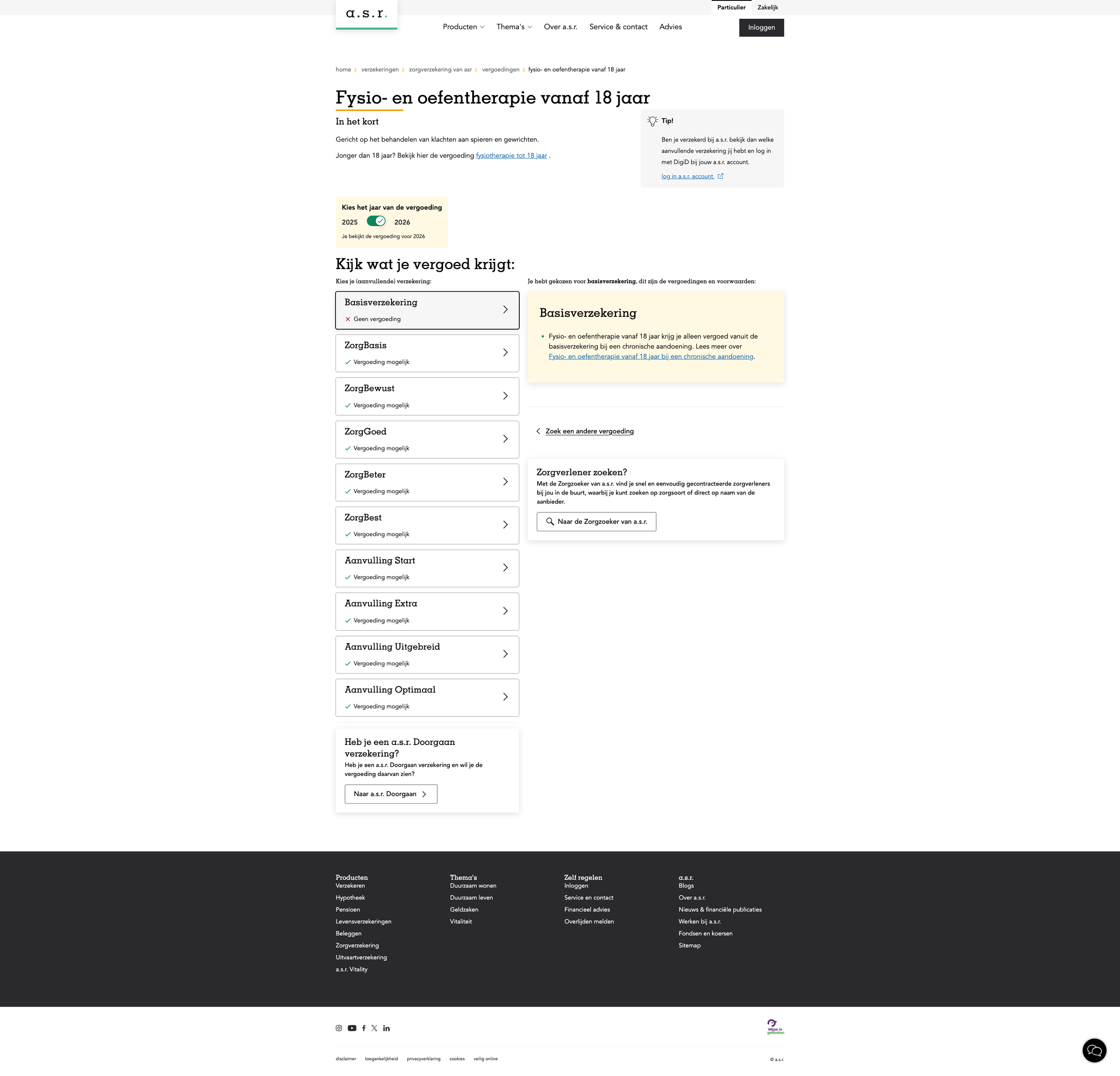
The "Reimbursements Finder" (Vergoedingenvinder) is a critical tool for customers to check if their treatment is covered.
The Problem: The search engine was built on internal policy logic (coverage codes), not user mental models (symptoms/treatments).
The Result: Users searched for "physiotherapy for back pain" but got zero results because the system required specific policy terms. This led to frustration, high drop-off rates, and expensive calls to customer support.
2. My Role: Lead UX & Service Architect
I didn't just redesign the UI; I orchestrated a shift in how the organization presents its services.
Scope: Strategy, Information Architecture (IA), Prototyping, and Stakeholder Management.
Team: Collaborated with Product Owners, Medical Specialists, and Front-end Developers.
Key Contribution: Aligning the rigid medical database with a human-centric front-end without breaking compliance.
3. The Solution: "Dual-Mode" Interaction
We moved away from a simple "keyword match" to a guided dialogue system.
A. Diagnosis & Blueprinting
I analyzed search logs and support tickets to map the gap between User Intent ("I hurt my back") and System Logic ("Paramedical Care Type B"). We used Service Blueprints to identify where the data translation failed backstage.
B. The "Hybrid" Search Interface
Pure AI isn't always trusted in healthcare, but rigid menus are frustrating. I designed a Dual-Mode Interface:
Smart Search (AI-assisted): Recognizes synonyms and symptoms, translating them to policy terms instantly.
Deterministic Paths: A structured "decision tree" for users who prefer clicking through categories.
Why this worked: It catered to both "searchers" and "browsers," significantly reducing the "No Results" error rate.
C. Governance & Scalability
To ensure the solution lasted, I established DesignOps guidelines for how medical terms should be presented. This ensured that future updates to policies wouldn't break the user experience.
4. The Outcome
By shifting the focus from "displaying policy" to "answering questions," we achieved a turnaround rarely seen in insurance tools.
Trust: Customers finally felt understood, reflected in the massive NPS jump (+63 points).
Efficiency: Fewer users needed to call support for simple coverage checks.
Future Proof: The new Information Architecture laid the groundwork for future Gen-AI integrations.
Why this matters for your team
This project demonstrates my ability to navigate highly regulated environments. I don't just design for the "Happy Path"; I design systems that handle complexity, manage business constraints, and deliver measurable business value.
Let's discuss your design challenges.
If you need a Lead who bridges the gap between Business, IT, and Design, let's talk.